By David Chan – Web Analytics Master
It makes our day when clients are happy and satisfied
Working smart and hard get us closer to this goal. Recently we spent an hour using Google trends to build an effective powerpoint deck to communicate clearly to our customer about our proposed outreach strategy, rest is history …..
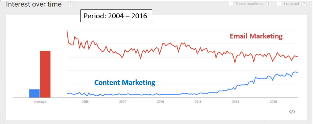
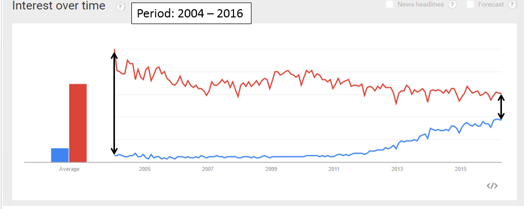
We need to prove creating content pillar for marketing outreach is getting more traction from marketeers than email marketing nowadays, this is how we do it.
Step 1 – Historical perspective, to be unbiased we show how has email marketing and content marketing performed over a long period of time.
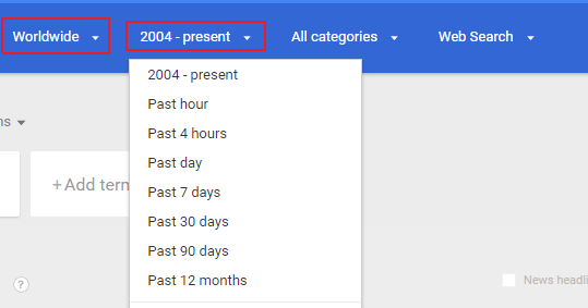
Using custom date range and worldwide market on Google trend allows us to get the trend needed.
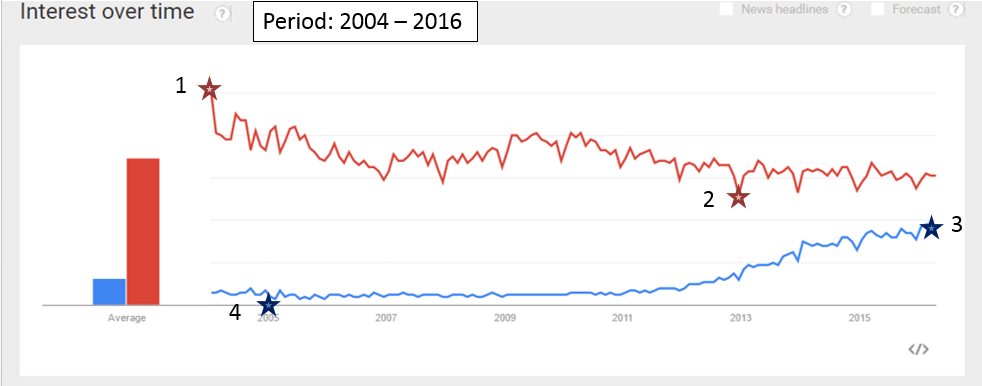
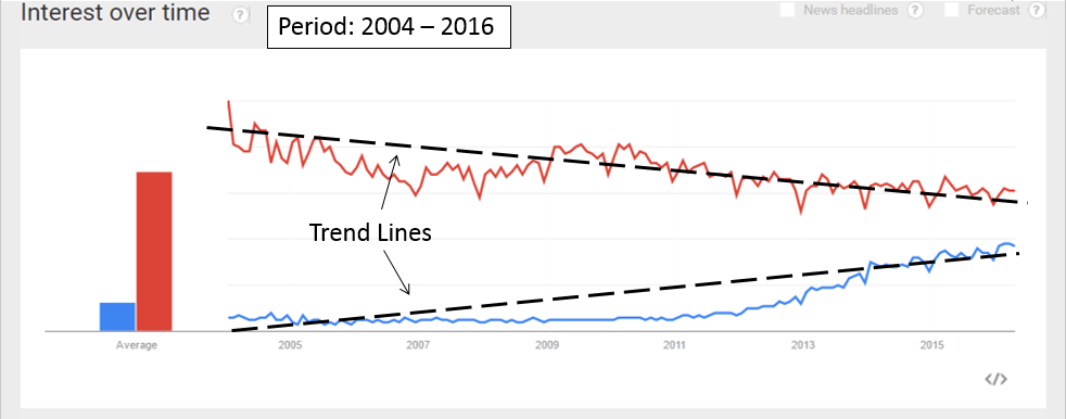
Step 2 – Develop a trend line to show trend movement, we clearly mark off the high and low points of each trend. Joining these points we are able to show content marketing is on the upward move.
Step 3 – Showing the rapid rise of content marketing, and the gap is getting narrow.
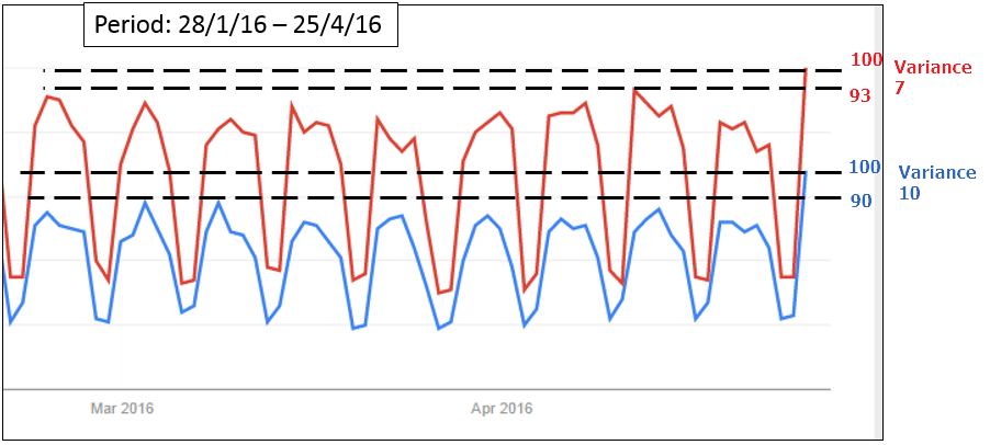
Step 4 – Show recent trend to provide more context to why we are recommending content marketing, we also presented the mathematical variance to better communicate with data.
A point to note is that variances here are not absolute numbers, rather preference points for comparing denomintors. Hence, we put the new peak as 100 and interpolate the old peak in relation to the new peak
Next time you need data to communicate with your client, try Google trends. It’s really simple and easy.
 Login as

